

Table of Contents
- The Core Differences at a Glance
- What Defines Classic British Animation Styles?
- What Defines American Cartoon Styles?
- How British Television Animation Techniques Shaped the Look
- Side-by-Side Comparison: Style, Budget and Tone
- Why Vintage Animation Memorabilia Still Resonates
- Collecting the Wobbly Era: What to Look For
- Conclusion
- Frequently Asked Questions
Last Updated: 25 September 2026
The Core Differences at a Glance
The classic British animation vs American cartoon styles divide comes down to three things: line quality, money, and tone. British studios worked small and fast, producing wobbly, marker-pen characters with dry, gentle humour. American studios built industrial cel-animation pipelines that delivered glossy, high-energy cartoons with broad appeal.
This guide from Roobarb and Custard explores both traditions, why the British approach still feels so distinctive, and how that "wobbly" era lives on in vintage animation memorabilia today.
The contrast matters because it shaped what we watched. A generation raised on imported American cartoons also grew up with homegrown shows that looked rougher, sounded funnier, and felt unmistakably ours.
What Defines Classic British Animation Styles?
Classic British animation is defined by hand-drawn imperfection: visible marker lines, uneven movement, and character designs built for personality rather than precision. Small teams drew everything themselves, so the line wobbled, and that wobble became the signature.
British television animation techniques grew out of limited budgets and tight broadcast schedules. Animators drew directly with marker pens, often on paper, then filmed frame by frame with minimal clean-up. Nobody was smoothing out the edges.
The Wobbly Line and Marker-Pen Aesthetic
The wobbly line is exactly what it sounds like. Characters were sketched with marker pens, and those sketch lines stayed visible on screen rather than being traced into clean cels. Movement looked jittery, alive, and slightly chaotic.
That imperfection was not a flaw. It gave every character a hand-made quality that cleaner animation could not replicate. A green dog could look manic simply because his outline refused to sit still.
Bob Godfrey and the Small-Studio Approach
Bob Godfrey is the name most associated with this school of animation. His studio produced character-driven work with small crews, quick turnaround, and a distinctly British sense of humour.
The small-studio model meant fewer people touching each frame, so the animator's own hand stayed present in the finished film. That directness is why the era's characters feel so individual.
What Defines American Cartoon Styles?
American cartoon styles are defined by cel animation and the studio system: assembly-line production, clean ink-and-paint finishes, and characters designed for mass merchandising. The look is polished, consistent, and built to scale.
Cel Animation and the Studio System
Cel animation placed drawings onto transparent sheets, inked and painted by teams, then photographed over painted backgrounds. Each frame passed through many hands, which demanded strict model sheets so characters looked identical every time.
That system produced remarkable consistency. It also produced cartoons engineered for syndication, spin-offs, and toy shelves. The art served the brand as much as the story.
How British Television Animation Techniques Shaped the Look
British television animation techniques shaped the look through constraint. Limited budgets ruled out large cel departments, so animators leaned on bold character work, strong writing, and movement that embraced its own roughness.
The result was a visual language where imperfection signalled warmth. Characters moved in sudden, springy bursts rather than smooth arcs. Backgrounds stayed simple. Dialogue and personality carried the show.
For anyone collecting vintage animation memorabilia, this is the detail that matters most. You can identify the British school by its line quality alone, long before you read a credit.
Side-by-Side Comparison: Style, Budget and Tone
Here is how the two traditions line up across the factors that actually shaped what appeared on screen.
| Factor | Classic British Animation | American Cartoon Styles |
|---|---|---|
| Line quality | Wobbly, marker-pen, visible sketch | Clean, inked, consistent |
| Production model | Small studio, few animators | Large studio, divided roles |
| Budget approach | Lean, fast turnaround | Higher spend, longer schedules |
| Tone | Dry, gentle, character-led | Broad, energetic, gag-led |
| Movement | Jittery, springy, hand-made | Smooth, polished, uniform |
| Lasting appeal | Cult nostalgia, collector interest | Mass-market recognition |
The pattern is clear. Where American cartoons chased polish and reach, British animation chased personality and speed. That single difference explains almost everything else on the list.
Roobarb 'Colour Pop' Limited Edition →
Why Vintage Animation Memorabilia Still Resonates
Vintage animation memorabilia resonates because it holds a specific moment of childhood. For anyone who grew up watching after-school telly, a character print or a retro t-shirt is not decoration. It is a direct line back to a particular afternoon, a particular sofa, a particular theme tune.
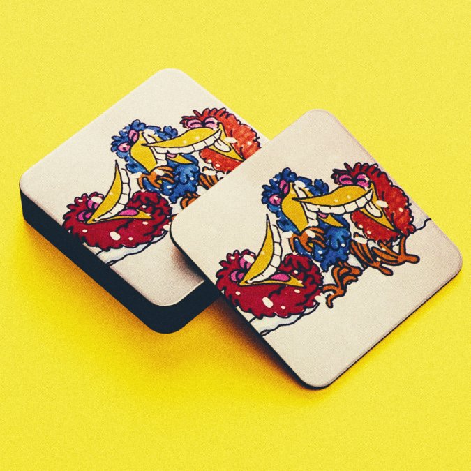
The wobbly era carries extra weight because it will not be repeated. Modern animation is digital, clean, and endlessly reproducible. The marker-pen look was a product of its limitations, and those limitations are gone.
That scarcity is why the British Film Institute's archive work on animation heritage matters to collectors. Preserving these films keeps the visual record of a genuinely distinctive period intact.
Collecting the Wobbly Era: What to Look For
Collecting the wobbly era starts with authenticity. Officially licensed merchandise carries the character designs, studio notes, and branding that unlicensed items simply copy badly.
A useful rule for collectors: if a design references genuine behind-the-scenes material, it is usually licensed. Animator style sheets, character proportions, and production notes are the kind of assets only an official partner can access.
Here is a quick checklist before you buy:
- Confirm the item is described as officially licensed merchandise
- Check for genuine studio artwork, not a redrawn imitation
- Look for UK printing or manufacturing details
- Note whether the run is limited and how many were produced
- Read the care instructions so the print survives washing
At Roobarb and Custard, our collection is built around exactly this principle. The Roobarb 'Colour Pop' Limited Edition Mounted Print, at £75.00, uses authentic character sketches and is limited to 100 prints worldwide. The Custard 'Colour Pop' Limited Edition Mounted Print matches it at £75.00, also capped at 100 prints.

For wearable pieces, the Official Roobarb & Custard "Roobarb Face Style Sheet" Animator Notes T-Shirt at £19.99 carries genuine animator notes on 100% organic cotton. The "Roobarb Style Sheet" Animator Notes Organic Cotton T-Shirt, also £19.99, shows front and side profiles with the original studio measurements. And the "Custard Style Sheet" Animator Notes Sweatshirt at £29.99 brings the same behind-the-scenes artwork to a heavyweight organic cotton layer.
Conclusion
The classic British animation vs American cartoon styles story is really a story about constraints. American studios had the money to chase polish, and they built an industry around it. British studios had small crews and marker pens, and they built something with more personality per frame.
That is the throughline. Polish ages predictably. Personality does not.
If you want to bring that wobbly era into your home, Roobarb and Custard offers officially licensed prints, apparel, and homeware featuring the characters and studio artwork from the original series. Our limited-edition prints are capped at 100 worldwide, and our organic cotton t-shirts and sweatshirts carry genuine animator notes you will not find on generic retro merchandise.

Get started with Roobarb and Custard and own a genuine piece of British animation history before the last prints disappear.
Frequently Asked Questions
What defines the classic British animation style?
It comes down to linework, budget and tone. British studios often worked with small teams and limited funding, so they leaned on loose, hand-drawn lines, flat colour and expressive character acting rather than polished movement. The result is a look that feels rough, energetic and personal. Roobarb and Custard is a perfect example: Bob Godfrey's studio used marker-pen sketches and deliberately wobbly outlines, which became the show's signature rather than a limitation to hide.
How does British animation differ from American cartoon aesthetics?
American cartoons of the same era were built on the studio system, with large animation teams, cel production and smooth, consistent movement. Characters were designed for mass merchandising and long-running series. British animation styles tended to be quirkier and more minimalist, with looser drawing, drier humour and shorter runs. Neither approach is better; they simply reflect different budgets, audiences and production cultures on each side of the Atlantic.
Why is British animation often described as quirky or minimalist?
Small budgets forced creative decisions. With fewer animators and less time, British studios stripped scenes back to essential shapes, used limited colour palettes and let narration or dialogue carry the story. That restraint produced a distinctive charm. In Roobarb and Custard, the wobbly lines and simple backgrounds put all the focus on character expressions and comic timing, which is exactly why the look still feels fresh decades later.
What should I look for when buying vintage animation memorabilia?
Check for official licensing first, since unlicensed items are common online. Look at print quality, materials and presentation. Limited edition runs, such as a print capped at 100 pieces worldwide, tend to hold appeal for collectors. For apparel, organic cotton and UK printing are good signs of quality. Wash inside-out on a low temperature and iron on the reverse to keep detailed artwork crisp for years.
How did production budgets influence British television animation techniques?
Tight budgets pushed British studios towards economical methods: fewer frames per second, repeated sequences, simple backgrounds and heavy reliance on strong writing and voice work. Rather than competing with the smooth cel animation coming out of larger American studios, they developed a style where imperfection became part of the appeal. That approach influenced generations of animators and remains the reason shows like Roobarb and Custard are studied today.